TOBACCO FREE FLORIDA

When your work is trusted with impact, your brand can’t afford to be unclear for even a second.

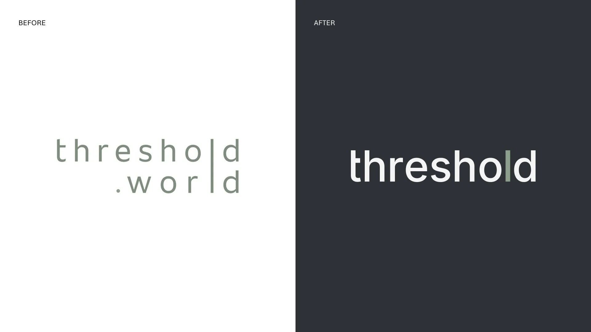
threshold partners with for purpose organizations to design and build solutions that help teams fundraise, manage data, and understand their impact. The company had grown, but the brand had not. Two names carried equal weight in market, threshold.world and b.world, splitting recognition and creating confusion. The offer was difficult to explain, and the identity was complex and inconsistent. For a B2B brand operating in mission critical work, confusion is a liability.

Dark cave with a view of a starry night sky and the Milky Way through the opening, with colorful rock formations inside.

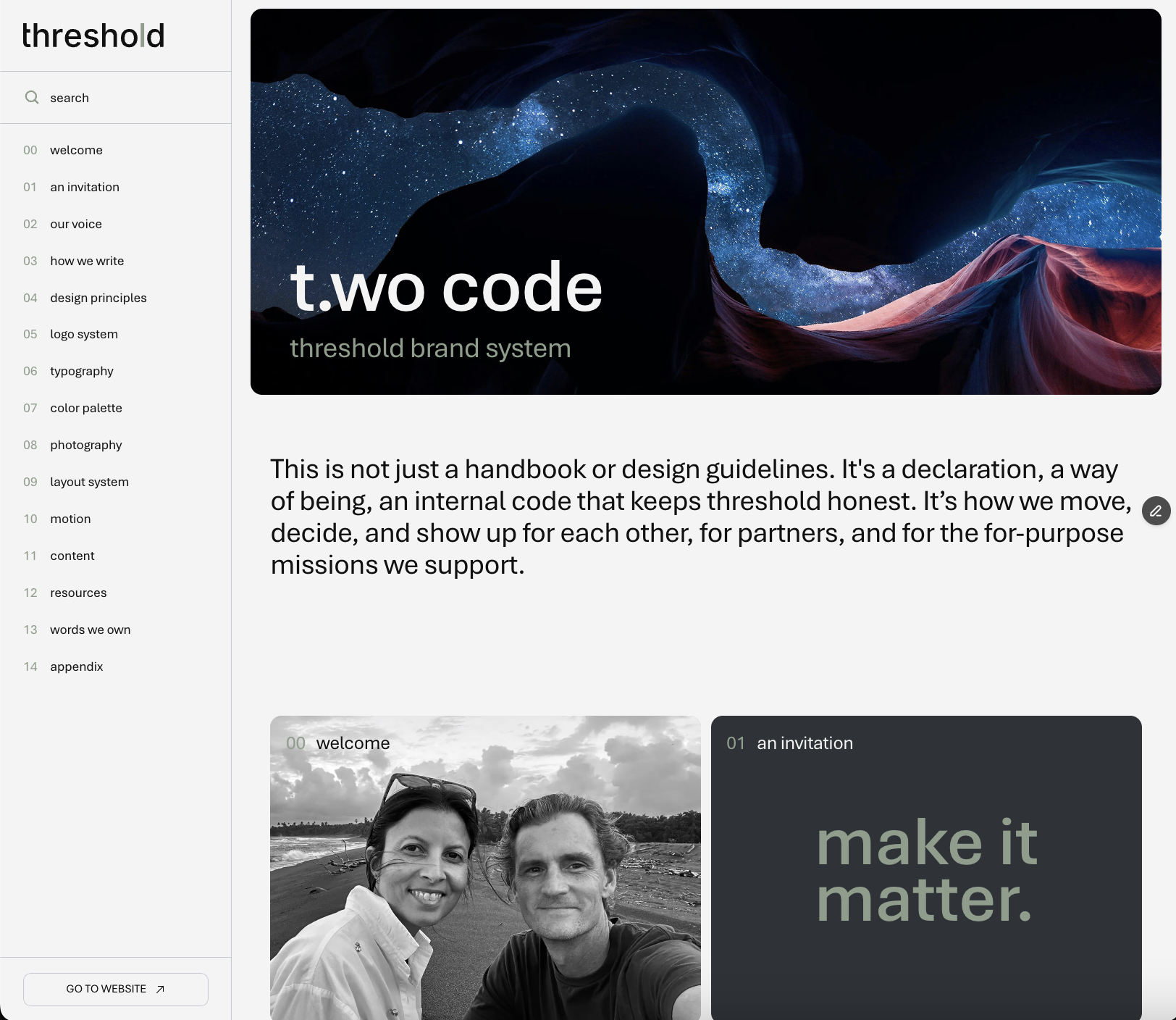
The work started where it should: inside the company.

We embedded with the team to uncover the foundation: a mission to build solutions for good, a vision for a regenerative future, and a defining value proposition that could organize everything, clarity.

Comparison of a logo before and after rebranding. The 'before' logo has a white background with lowercase text 'threshold.world' in greenish-gray. The 'after' logo has a dark background with the same lowercase text in white and a greenish-gray 'l' in the middle.
Digital presentation slide showing elements of branding including the logo 'threshold', typography, color palette, photography, layout systems, and design principles.

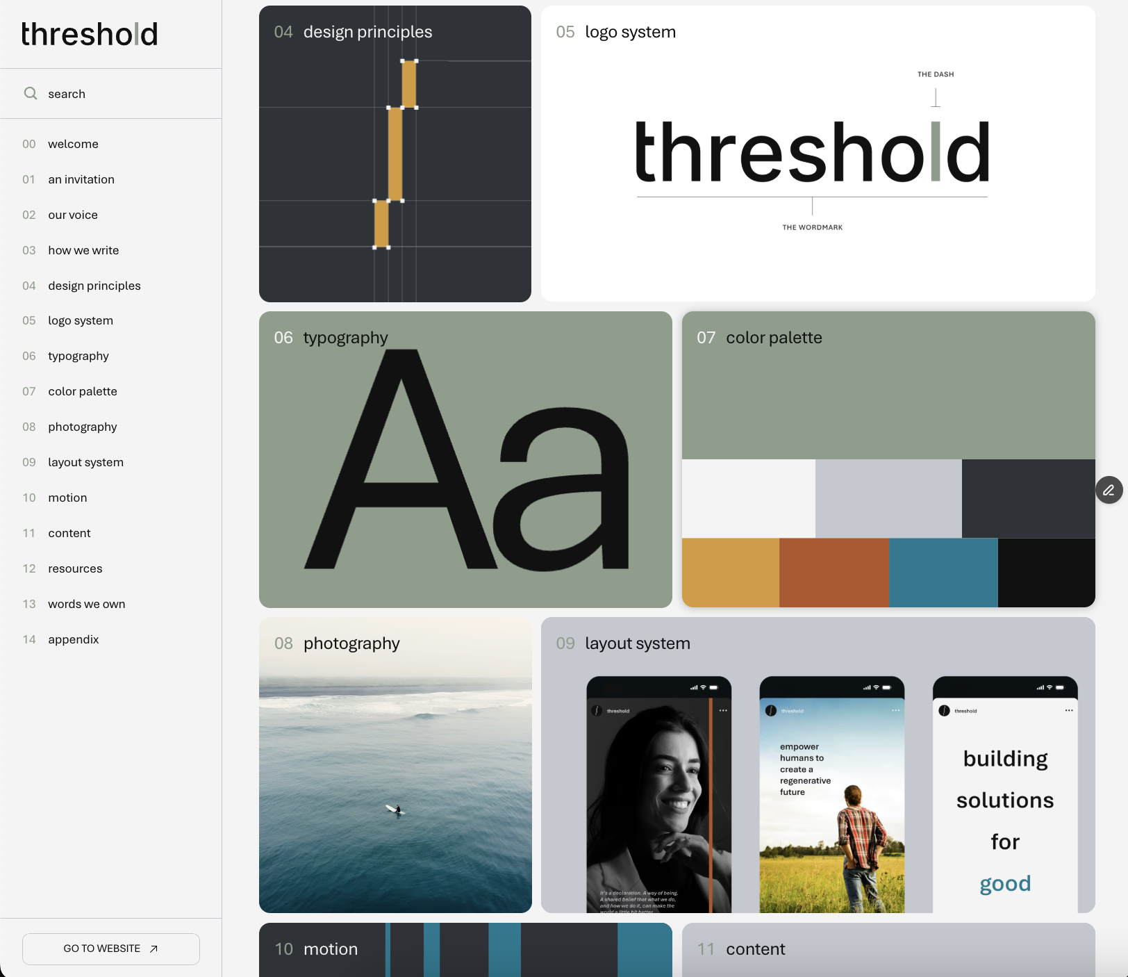
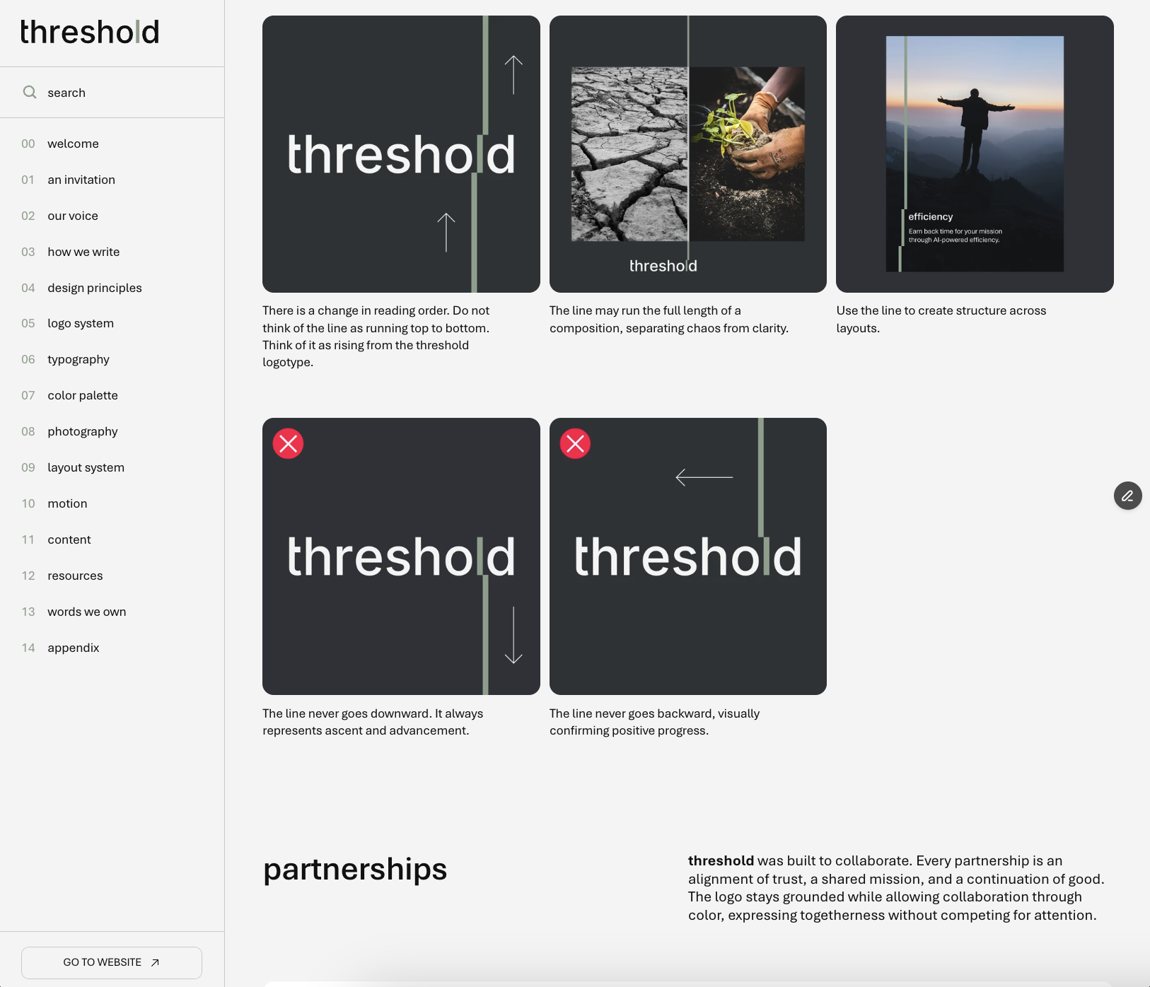
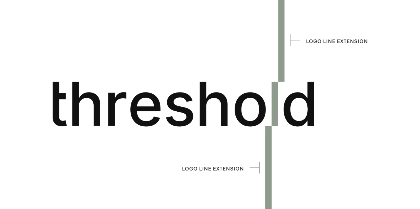
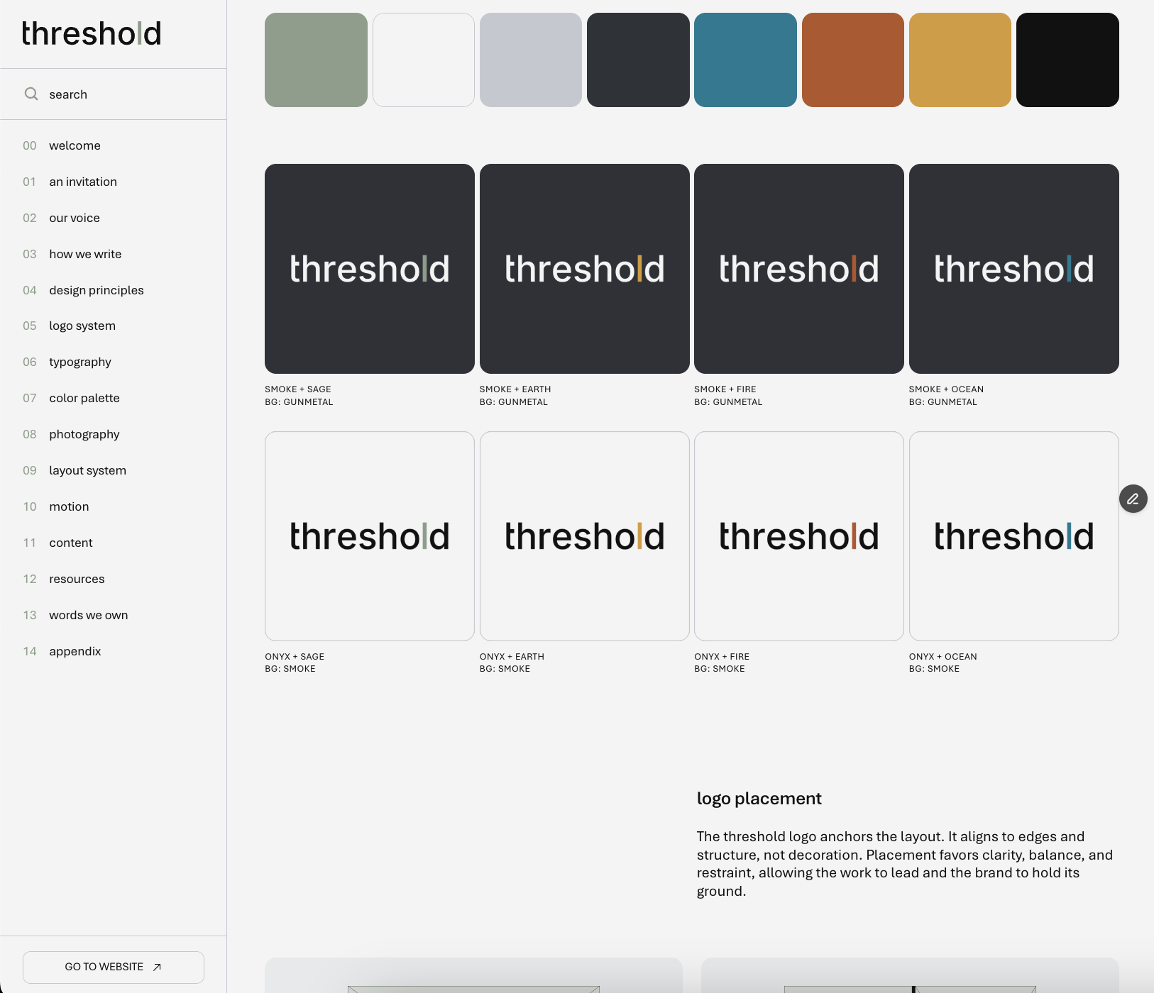
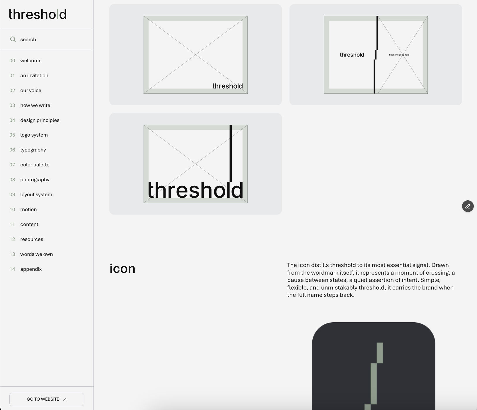
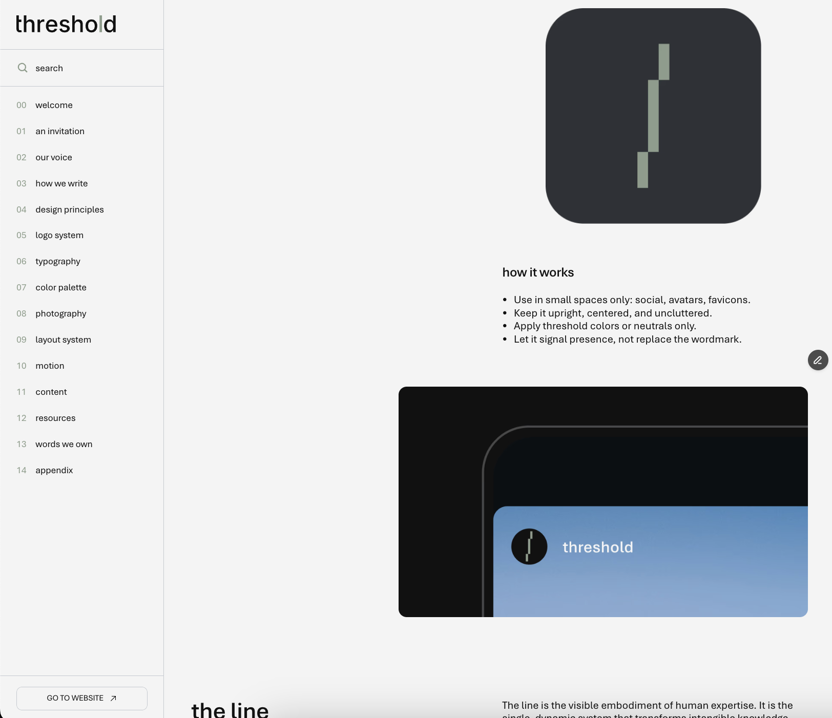
Pulled from the wordmark and extended into a line. The threshold dash marks the moment where complexity becomes clarity. Then brings that clarity everywhere threshold shows up by framing content, setting hierarchy, and guiding the journey. 

Screenshot of a website titled 't.w0 code, threshold brand system.' The page includes a menu on the left, a large header image of a starry night sky with rock formations, and a paragraph describing the brand's internal code and mission. There are smaller images below, one showing a black and white photo of two people outdoors and another with the text 'make it matter.'
A diagram illustrating the relationship between credibility, logic, and emotion with a background of a person underwater, swimming, and sunlight filtering through the water.
Screenshots of a digital presentation about the word 'threshold,' showing different visual layouts and explanations of the concept of a threshold line, with images of cracked earth, gardening, and a person on a mountain at sunset.
Screenshot of a webpage about the threshold logo suite. The page features the threshold logo with its color scheme and partnership with Microsoft. It describes usage notes about the logo's elements, including a vertical line connecting threshold and partner marks, and provides a download button for the logo suite.

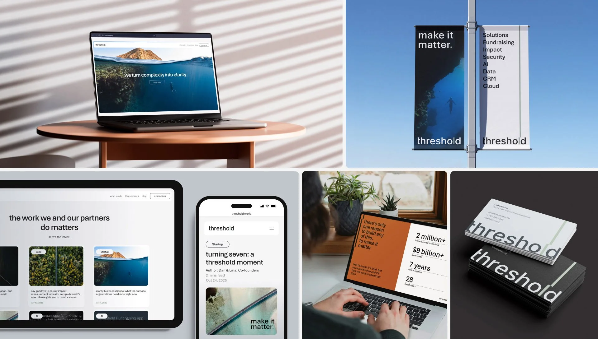
The system was codified in the brand book and implemented across the website, social, templates, decks, communications, and event and partnership applications.

We brought the system to life across the brand book, website, social templates, and real world moments like the NetHope partnership and event presence.

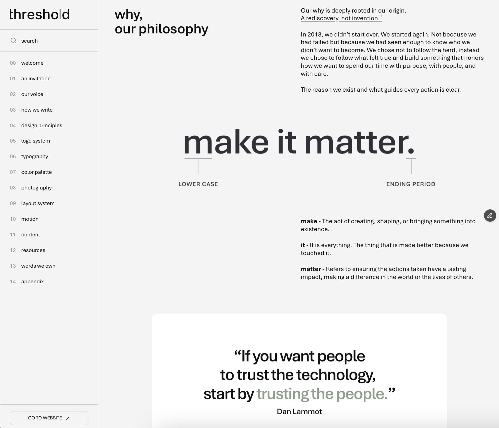
From there, we rebuilt threshold around the job it is hired to do: turn complexity into clarity.

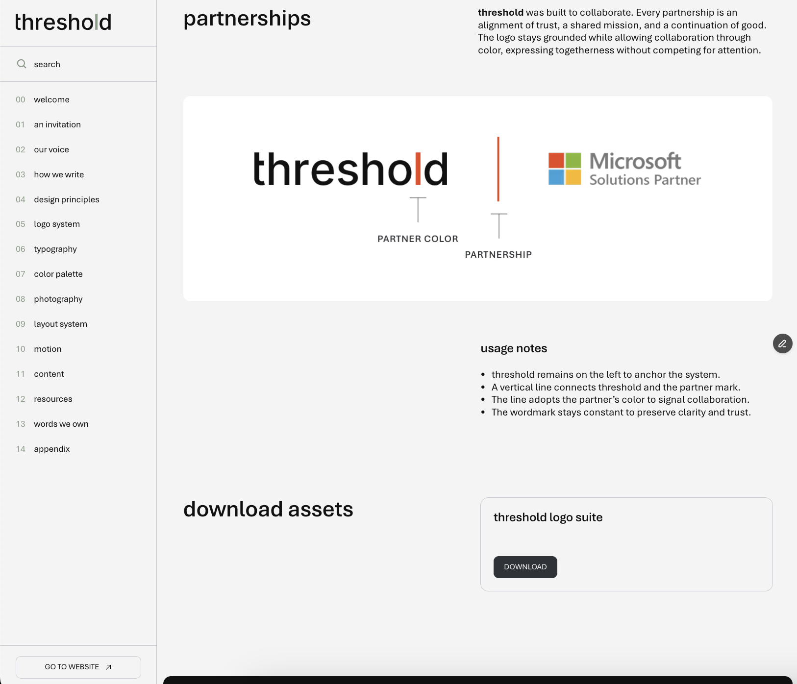
We unified the company under one name, rebuilt the logo for legibility, and created a scalable identity system anchored by the threshold dash, a simple tool that connects, organizes, and guides.

A design diagram with the word 'threshold' in large black font, lines labeled 'LOGO LINE EXTENSION' on the right and bottom, and a vertical green line separating the main word from the text lines.
Various marketing and branding visuals for 'threshold,' including digital screens, a smartphone, and outdoor advertisements, highlighting themes of solutions, efficiency, and building solutions for good.
Large uppercase and lowercase letter 'A' with the text 'APTOS' in the bottom right corner, on a dark background.
Color palette with ten swatches labeled sage, smoke, slate, gunmetal, earth, fire, ocean, onyx.
A collage of four images: a woman with curly hair wearing a yellow shirt smiling; a narrow canyon with red rock formations; computer code on a screen; a woman in traditional attire smiling in a green field.

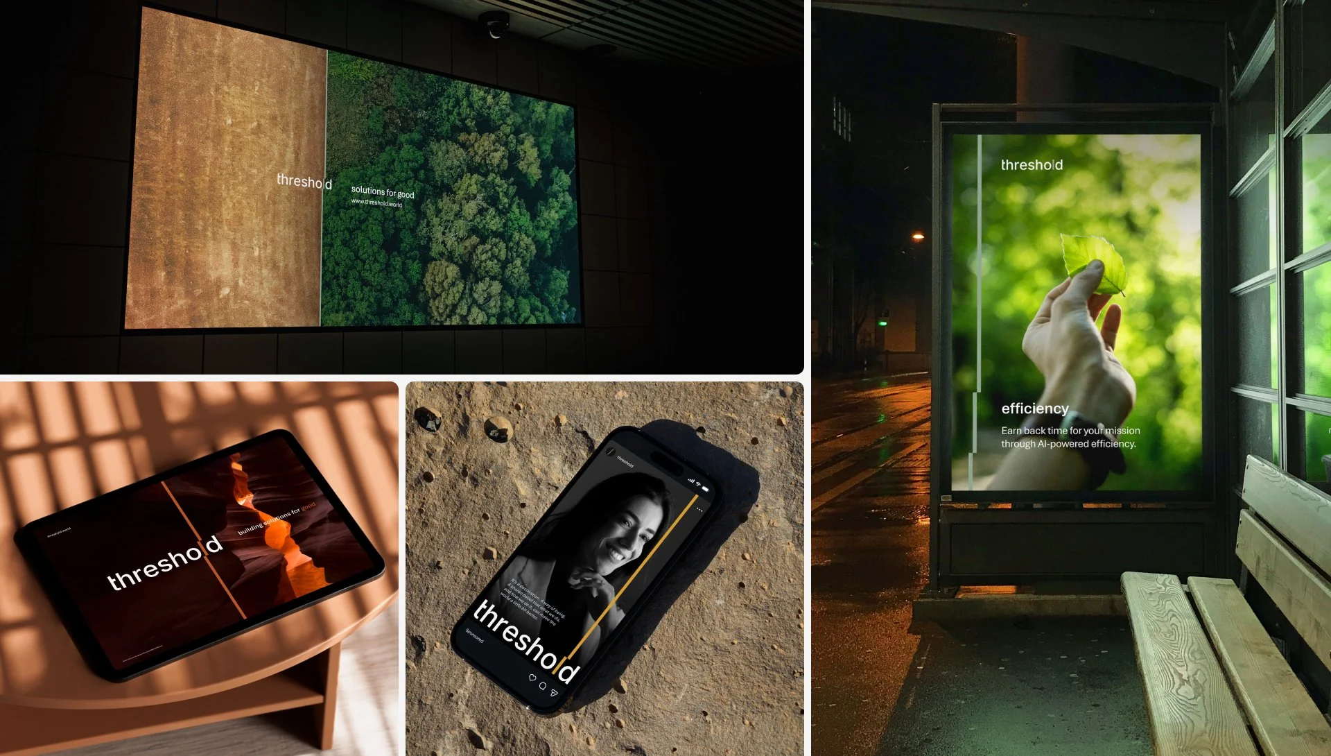
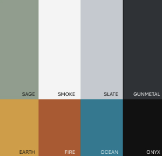
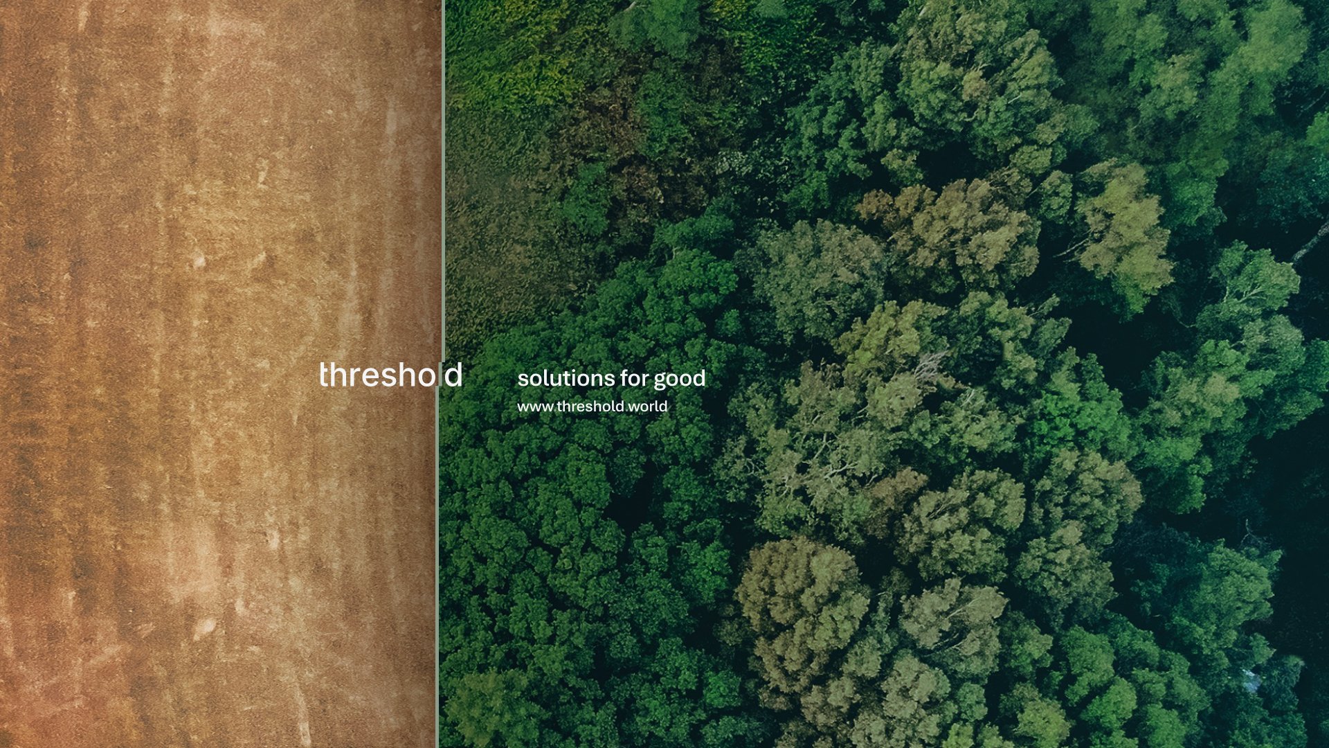
Supporting elements reinforce clarity at scale through legible typography, grounded photography, and a color world rooted in elemental references: earth, fire, ocean, and air. The motion line structures, reveals, transitions, and connects.

An aerial view of a cleared field on the left and a dense green forest on the right, with text overlaid that reads 'threshold solutions for good' and a website address.
Collage of images showcasing digital screens, a website titled 'threshold', a banner with 'make it matter' and various keywords, a person using a laptop, a stack of business cards with 'threshold' branding, and some potted plants.
A color palette and various logo design examples for 'threshold' with different background and text color combinations, including text and layout explanations.

Over the years, more than 1,200 organizations have relied on threshold, and a total of $1.8B in global funding has been connected through its platform. The refreshed identity now matches the responsibility of the work and is built to scale trust.

Webpage displaying a philosophy statement about making a difference, with sections explaining the phrase 'make it matter' in bold text, accompanied by definitions of 'make', 'it', and 'matter'. The left sidebar contains a list of menu items such as search, welcome, invitation, voice, writing, design principles, logo system, typography, color palette, photography, layout system, motion, content, resources, words we own, and appendix.
A webpage displaying a graphic of the word 'threshold' with a vertical line dividing the word and an explanation of the icon's meaning, indicating a crossing or pause between states.
Screenshot of a webpage detailing the 'threshold' logo system, showing the logo with a vertical line separating 'threshold' and the Microsoft Solutions Partner logo, with labels indicating 'partner color' and 'partnership'.
A webpage with a sidebar menu on the left and text on the right. The sidebar menu includes sections like welcome, invitation, our voice, and design principles. The main text discusses a mission and value proposition with a quote: "Make it human. Make it matter." and a photo of a person observing a desert landscape at sunset, with rock formations and a pink-orange sky.
Screenshot of a website page about 'threshold' design principles, showing a black icon with a line graphic and instructions for its use, and a section titled 'how it works' with bullet points.

CREDITS
Agency: Tomato Tomate Founder/CCO: Jose Benítez Strategy Director: Natalie Sophia Gandy Executive Creative Director: Ricardo Muñoz Design Director: Jesse Echevarría Senior Motion Designer: Abel Zhang Web Designer: Ana Barcena CD/Art Director: Francisco Arranz
CLIENT: threshold CMO: Beatriz Ayala Muñiz CEO: Lina Pérez Lammot CEO: Dan Lammot