
-
clarity in line with impact
After seven years of building software solutions for nonprofits and the broader for-purpose sector, threshold had become more capable than its brand made it seem. Tomato Tomate partnered with threshold to simplify and strengthen the brand from the inside out, shaping its mission, vision, value proposition, positioning, naming strategy, brand architecture, voice and visual identity. Then brought that work to life through the brand book, website, presentations, events, and other key touchpoints, giving the team the tools to show up with greater clarity and consistency across sales, internal culture and external communications. The result was more than a rebrand. It was a stronger threshold: easier to understand, more distinctive in how it shows up, and better equipped to earn trust, communicate value, and build momentum.
Helping threshold move forward with more clarity, more confidence, and a brand built for their mission.
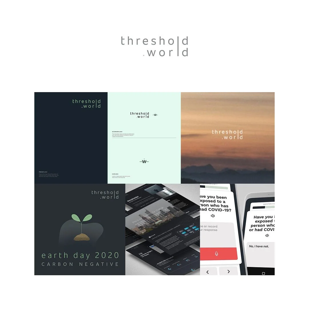
OLD IDENTITY
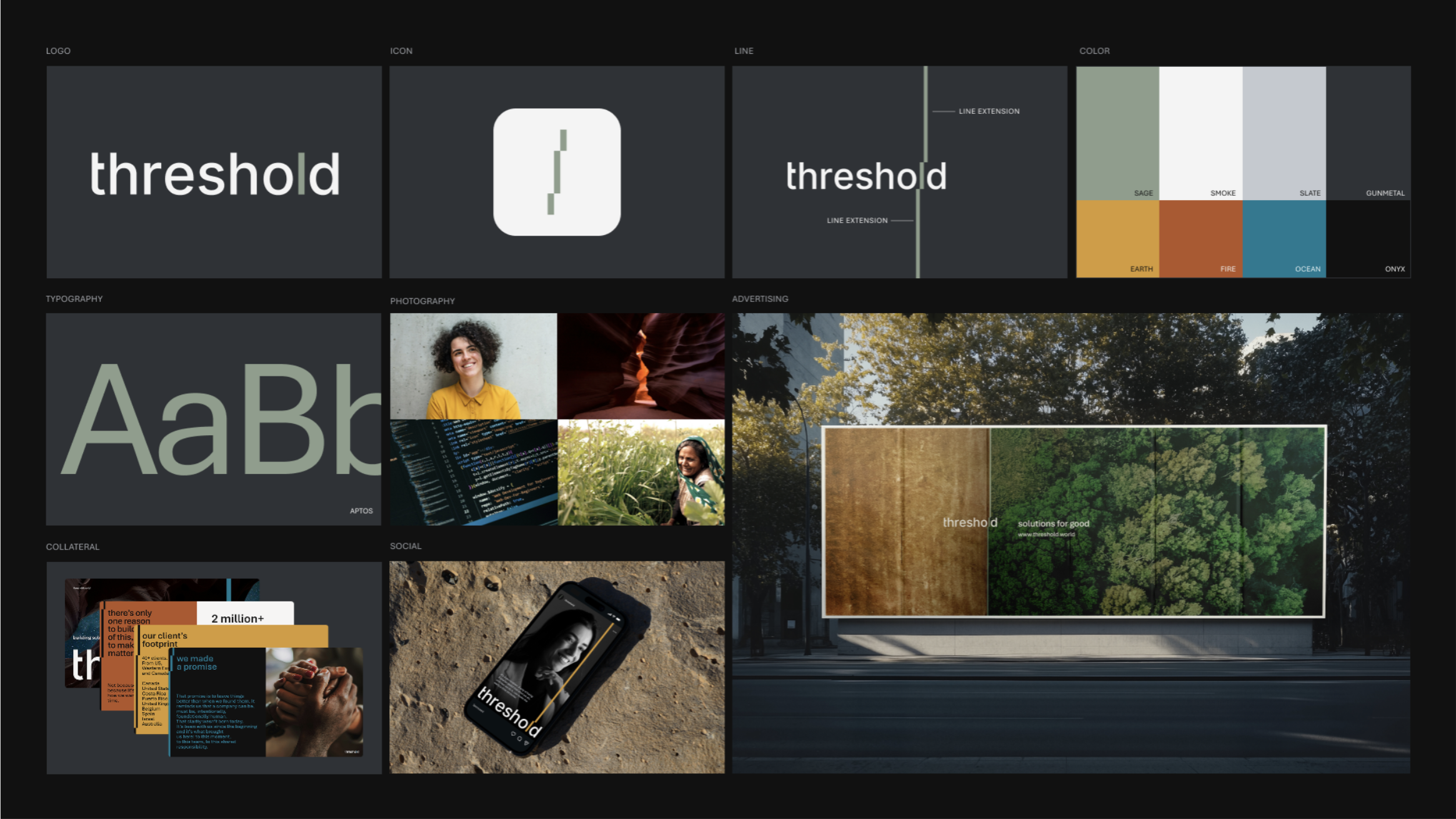
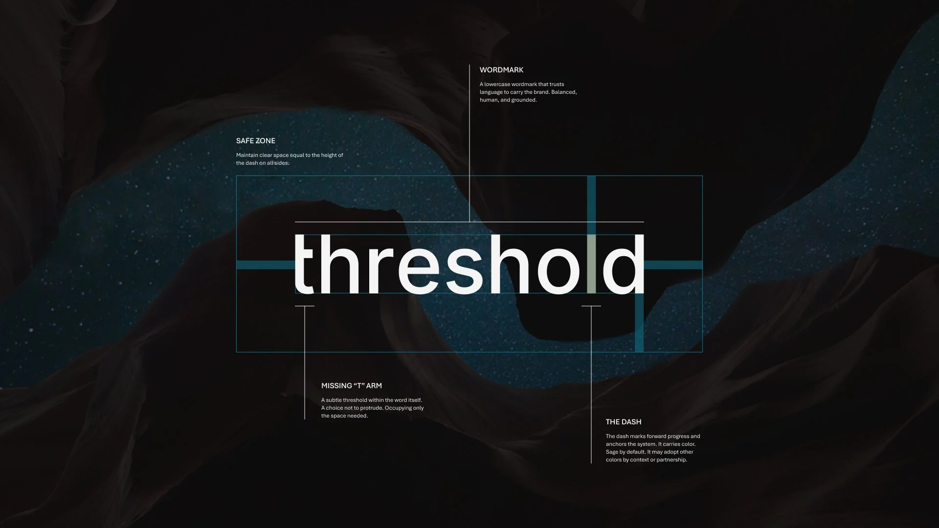
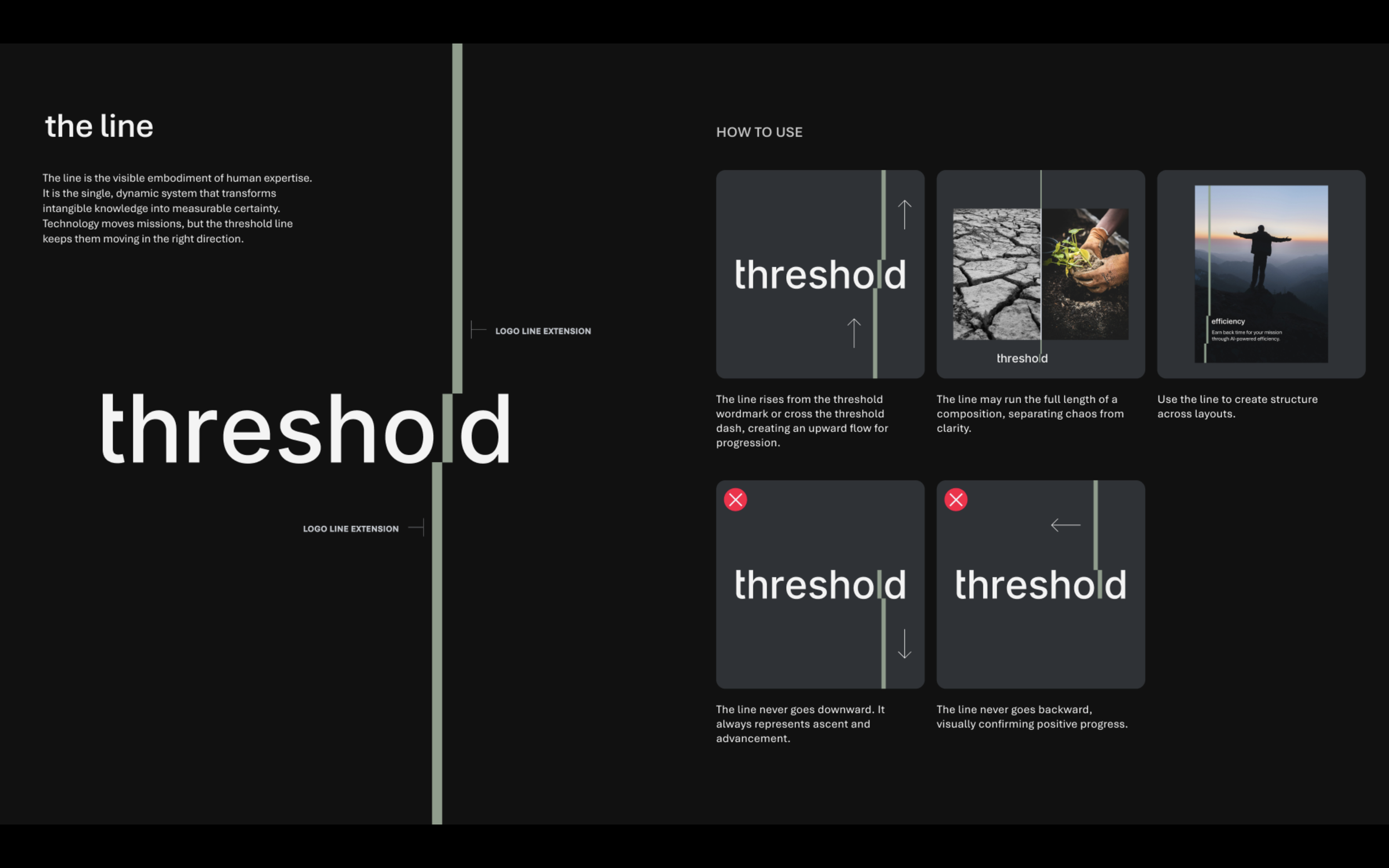
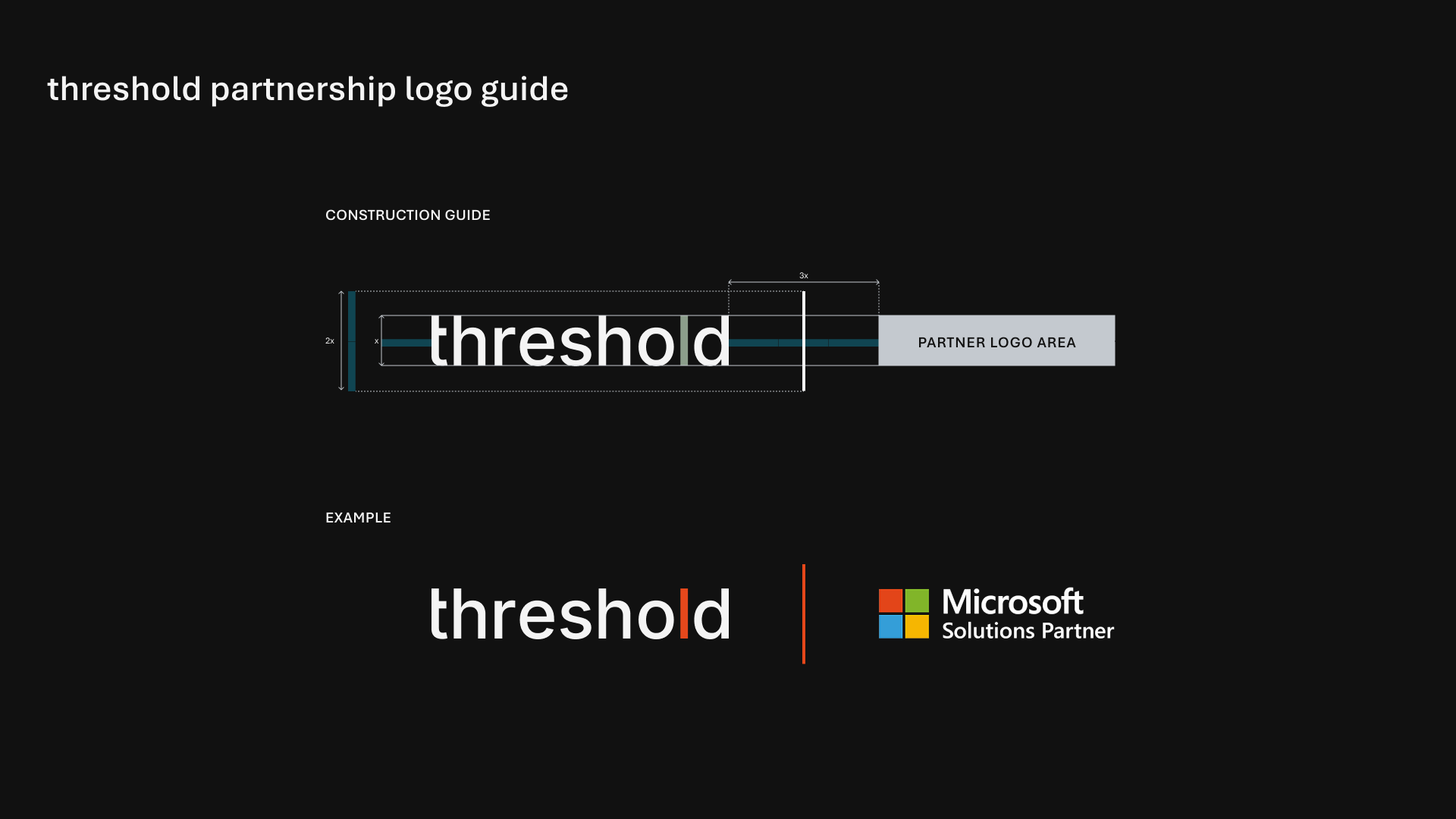
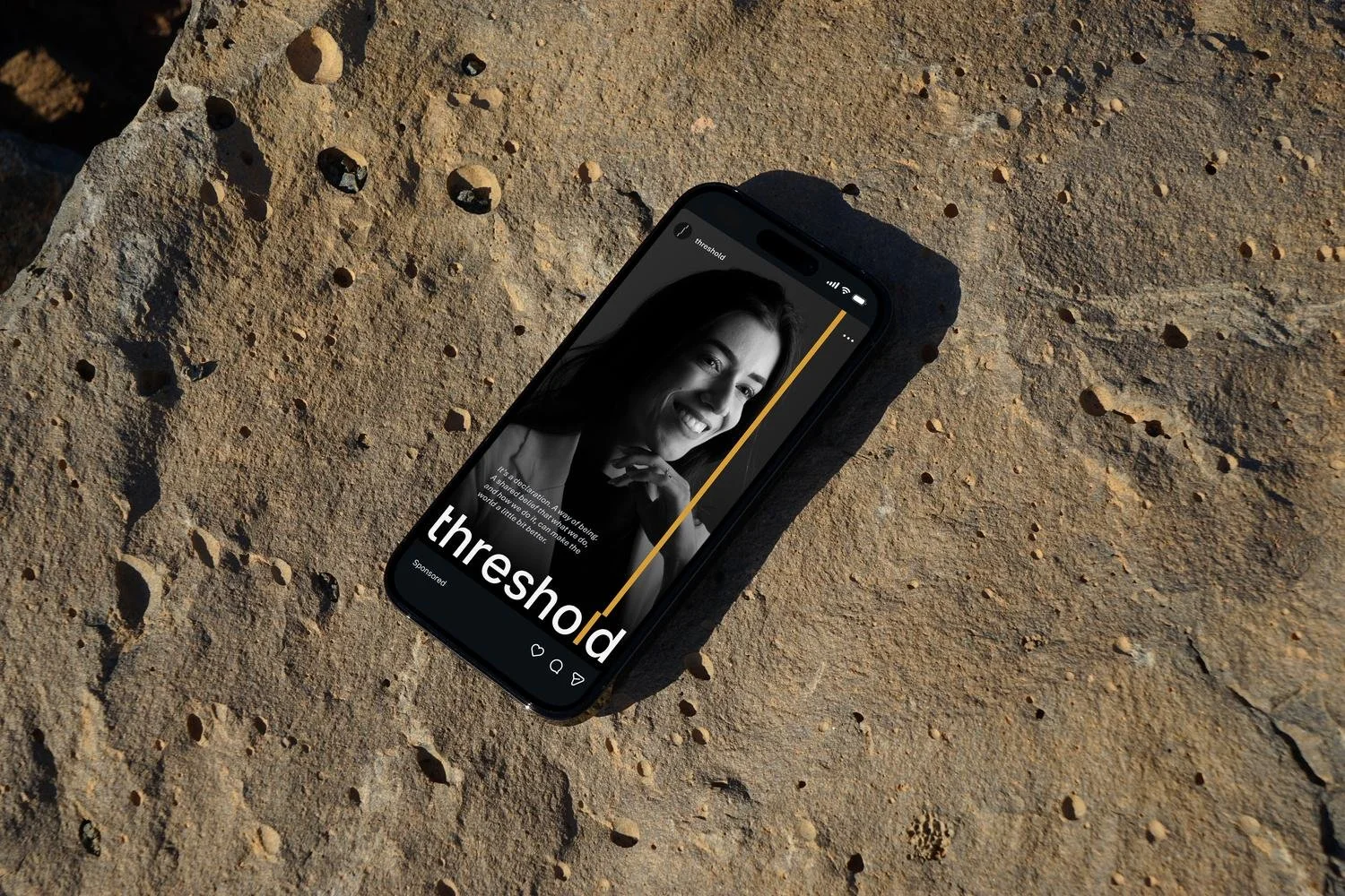
At the center of the identity is the threshold dash line. Extended from the wordmark, it marks the moment where complexity becomes clarity. At the heart of the brand. All to serve their newly defined mission of building solutions for good. The line becomes the organizing principle for the system, guiding layout, motion, and hierarchy across the brand.
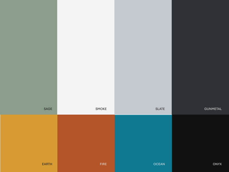
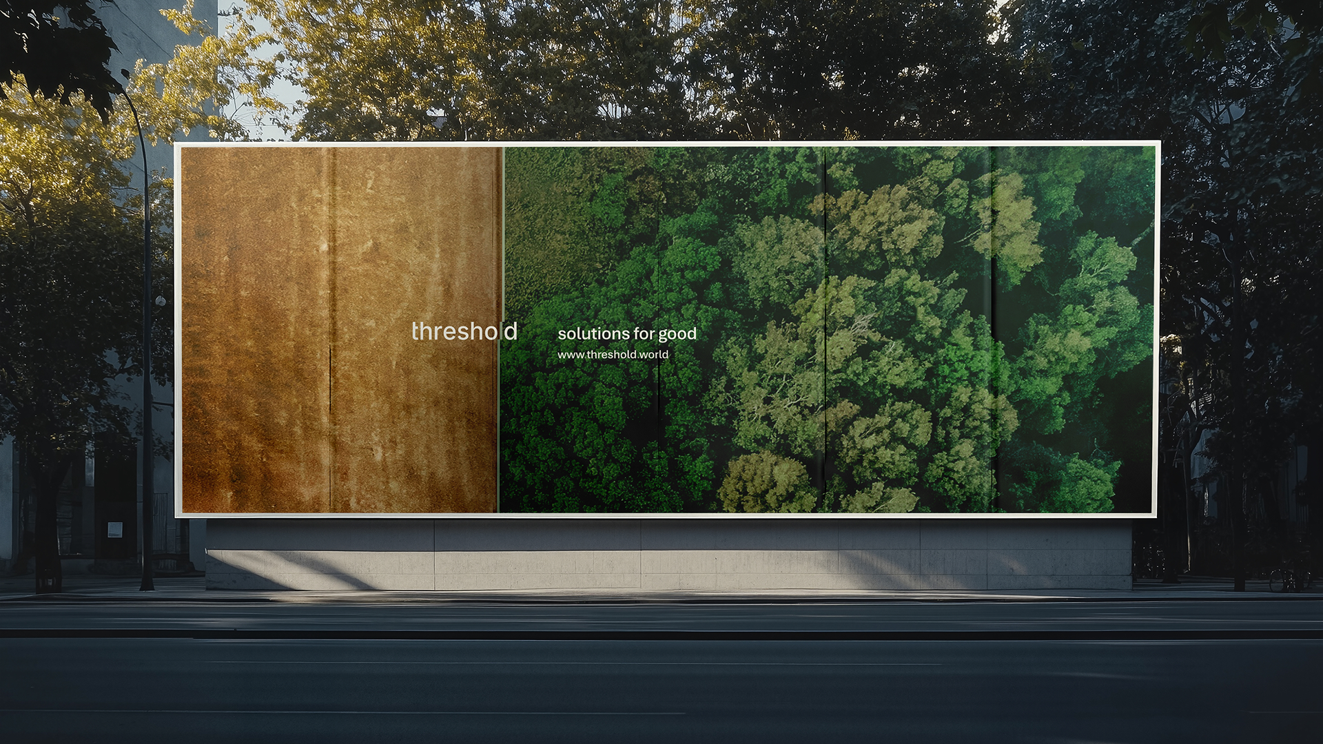
Typography, color, and photography work together as the brand’s supporting structure. The type system prioritizes clarity and legibility, the color palette draws from grounded tones that signal stability and responsibility, and the photography focuses on real people and real contexts—reminding us that impact lives beyond the software.

Motion brings the system to life. Elements align, slide, and resolve along the axis of the dash, turning the idea of finding clarity into a simple visual behavior that repeats across product, presentations, and digital spaces.
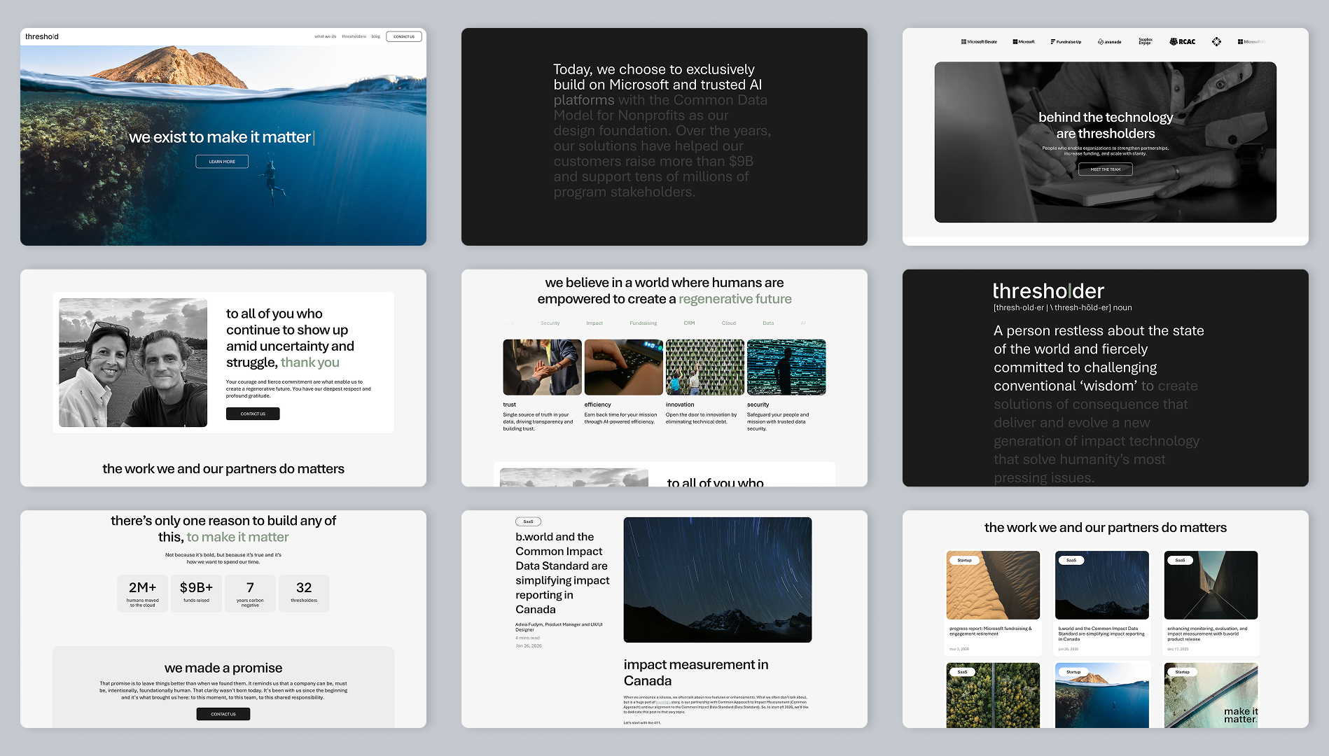
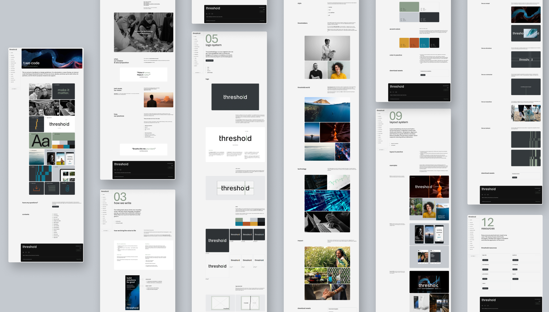
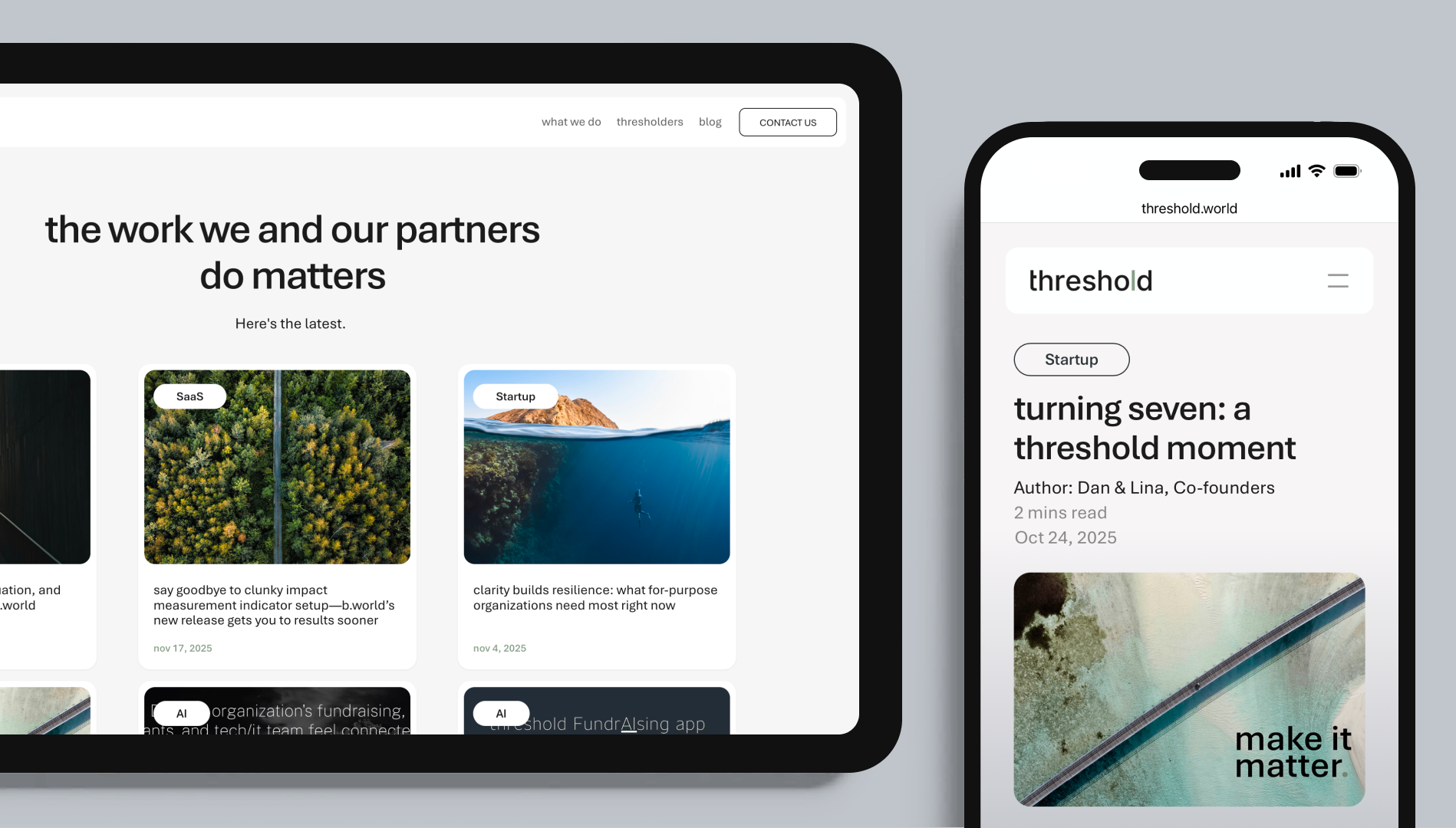
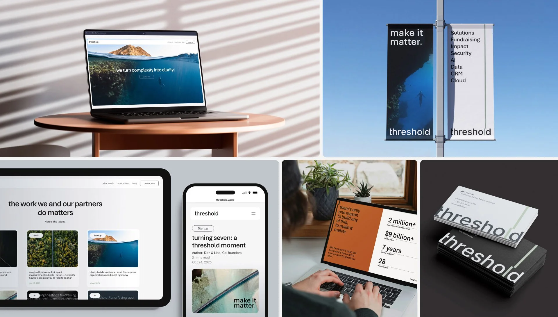
The identity extends into a complete digital system. The website simplifies complex information through clear layouts and clean motion, the blog creates a flexible space for storytelling and thought leadership, and the brand book ensures the system can scale consistently across every touchpoint.




FOUNDATIONS | IDENTITY | LOGO | SYSTEM | DESIGN | STORY | COPYWRITING | CREATIVE DEVELOPMENT | STRATEGY | NAMING STRATEGY | BRAND BOOK | WEBSITE